Menu
Color
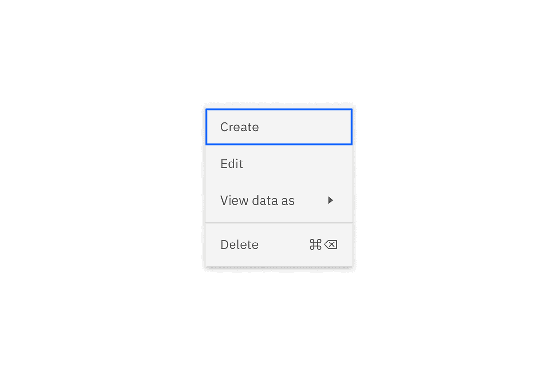
Default state
Refer to the button for primary and secondary button styling in the transactional modal.
| Elements | Property | Color token |
|---|---|---|
| Menu option | background-color | $layer * |
| text-color | $text-secondary | |
| border-top | $border-subtle | |
| Caret icon | svg | $icon-secondary |
| Shortcut icon | svg | $icon-secondary |
| Container | box-shadow | 0 2px 6px 0 rgba(0,0,0,.2) |
* Denotes a contextual color token that will change values based on the layer it is placed on.
Interactive state color
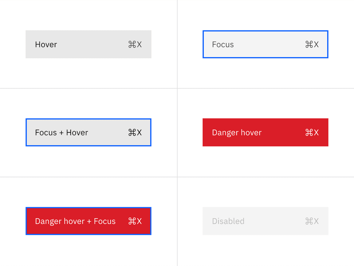
Menu items have six interactive states – hover, focus, focus and hover, danger hover, danger hover and focus, and disabled.
| State | Element | Property | Color token |
|---|---|---|---|
| Hover | Menu option | background-color | $layer-hover * |
| Menu option | text-color | $text-primary | |
| Icon | svg | $icon-primary | |
| Focus | Menu option | background-color | $layer* |
| Menu option | border | $focus | |
| Focus and hover | Menu option | background-color | $layer-hover * |
| Menu option | text-color | $text-primary | |
| Icon | svg | $icon-primary | |
| Menu option | border | $focus | |
| Danger hover | Menu option | background-color | $support-error |
| Menu option | text-color | $text-on-color | |
| Icon | svg | $icon-on-color | |
| Danger hover and focus | Menu option | background-color | $support-error |
| Menu option | text-color | $text-on-color | |
| Icon | svg | $icon-on-color | |
| Disabled | Menu option | background-color | $layer * |
| Menu option | text-color | $text-disabled | |
| Icon | svg | $icon-disabled |
* Denotes a contextual color token that will change values based on the layer it is placed on.
Typography
| Element | Font-size (px/rem) | Font-weight | Type token |
|---|---|---|---|
| Menu option text | 14 / 0.875 | Regular / 400 | $body-compact-01 |
Structure
| Element | Property | px / rem | Spacing token |
|---|---|---|---|
| Icon | icon size | 16 / 1 | – |
| Option (default) | padding-right, padding-left | 16 / 1 | $spacing-05 |
| Option (selectable but unselected) | padding-right, padding-left | 16 / 1, 40 / 2.5 | $spacing-05, $spacing-08 |
| Option (selectable and selected) | padding-right, padding-left | 16 / 1 | $spacing-05 |
| Option (next to the divider) | margin-top, or margin-bottom | 4 / .25 | $spacing-02 |
| Option (first and last) | margin-top, or margin-bottom | 4 / .25 | $spacing-02 |
| Divider | margin-top | 1px | – |
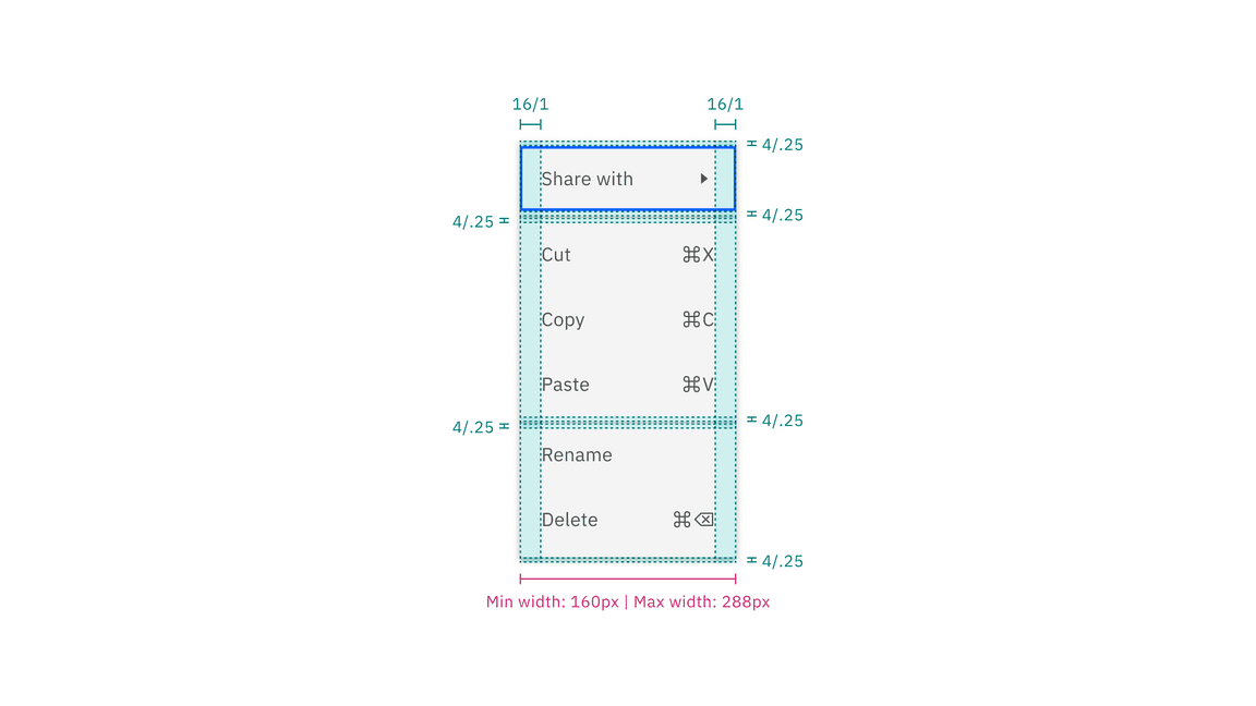
Structure and spacing measurements for main menu
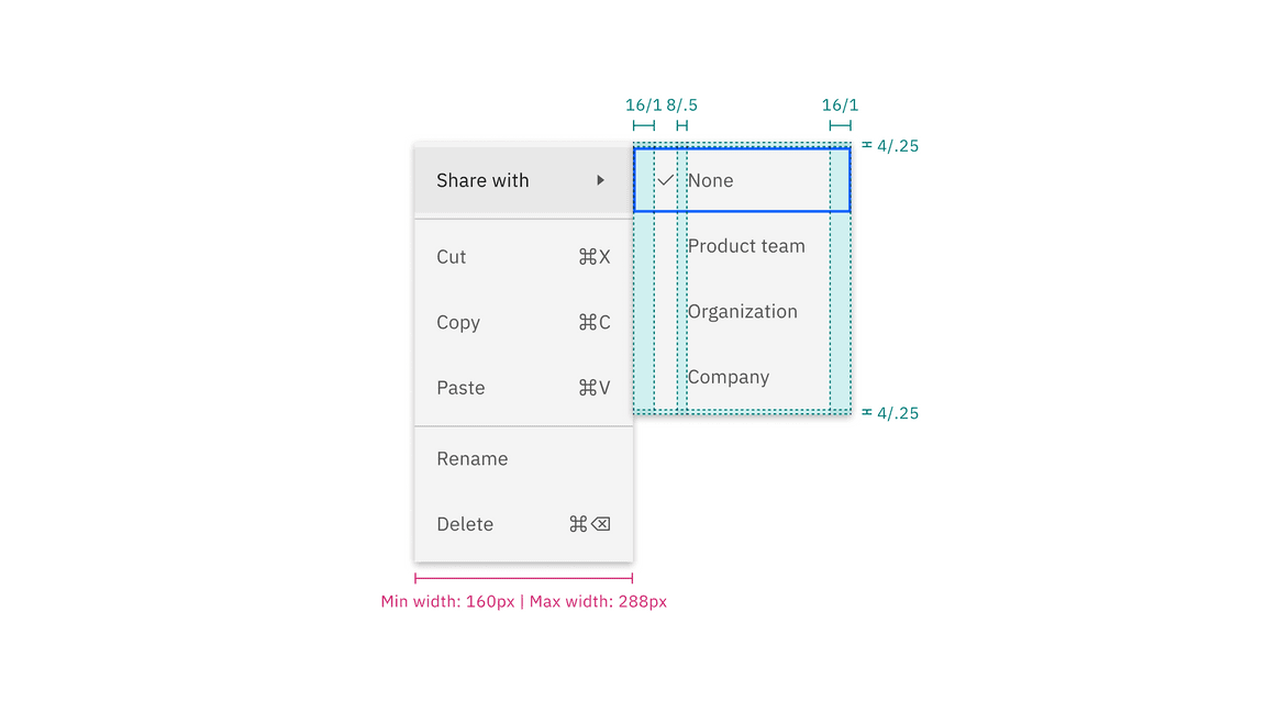
Structure and spacing measurements for submenu
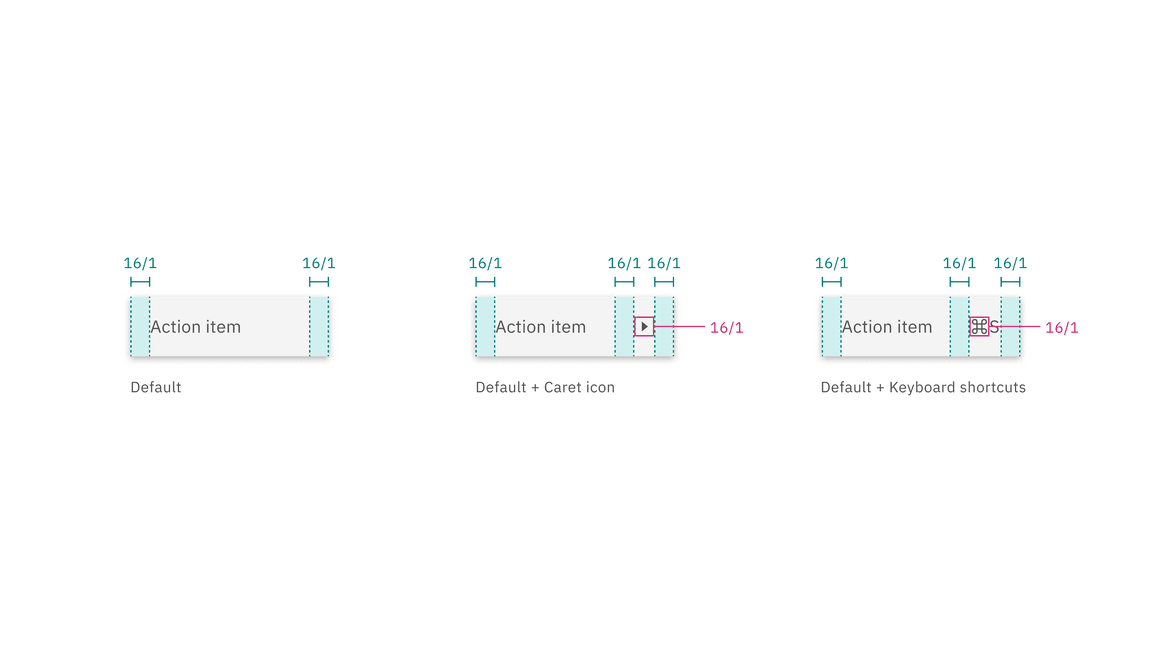
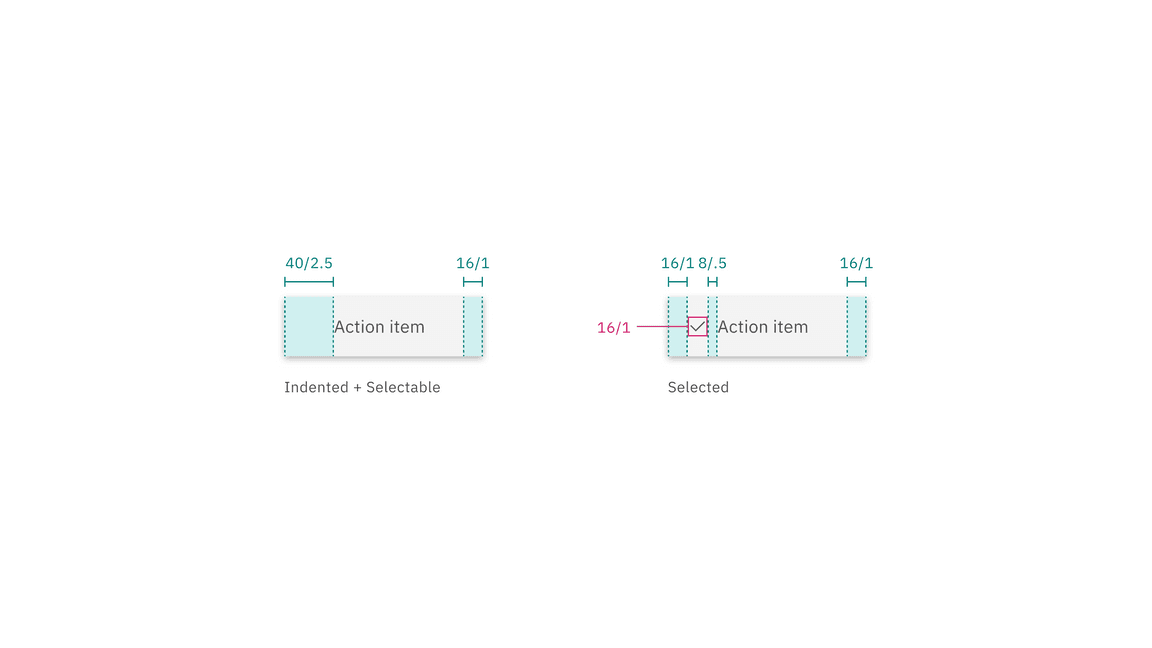
Structure and spacing measurements for individual menu option items
Sizes
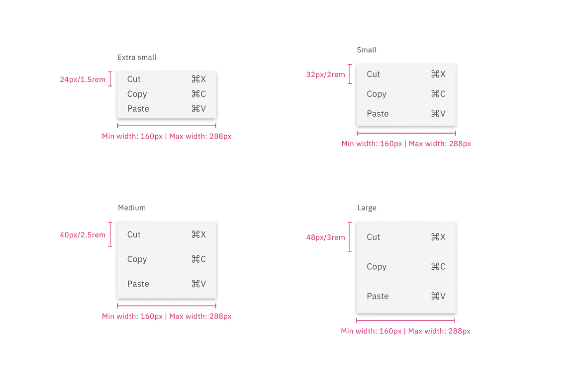
The height of a menu is determined by a menu button. Menus have a fixed minimum width of 160px (or 10rem), to ensure menu items have sufficient horizontal space, while also having a fixed maximum width of 288px (or 18rem).
| Elements | Size | Height (px/rem) |
|---|---|---|
| Menu option | Extra small (x-sm) | 24 / 1.5 |
| Small (sm) | 32 / 2 | |
| Medium (md) | 40 /2 .5 | |
| Large (lg) | 48 / 3 |
